Background
As described in my previous post, my job is to assemble a software suite that is used by aerospace engineers to design civillian UAVs. Our main use case being search and rescue.
Every aircraft design starts its life in a concept tool where the configuration choice (V-tail, canard, flying wing, …) is made and where the principal geometrical parameters (wing area, CoG, tail volume, …) are decided. This then allows the calculation of the approximate weight and performance of the aircraft (e.g., maximum speed, range, endurance, …).
While this concept stage is only a rough approximation it already involves (in our case) some 250 variables which are interlinked in a complex web of equations. These sizing equations capture a great deal of knowledge about the physics of flying an aircraft as well as empirical relationships drawn from historical & experimental data. Solving these equations is really a Multidisciplinary Design Optimization (MDO) problem, a whole field of research in its own right.
After working with the Pacelab Suite for a year we have (for various reasons) switched to spreadsheets for implementing & experimenting with the sizing equations. This brings great flexibility for the designer but makes things more tricky to parallelize & optimize for me. For example, I cant just throw Excel on the 8000+ core linux cluster we have here. Also, while the inbuilt solver plugin is easy and quick for solving small scale systems. As our equation system got more complex the process just breaks down.
It was also clear that our sizing complexity had outgrown the spreadsheet UI and had become hard to understand for a newcomer.
Early experiments
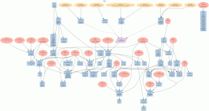
Being a programmer I feel more at home manipulating code than manipulating spreadsheets. Early on I had already experimented with visualizing the sizing logic by customizing and extending the Trace addin. This resulted in images like this:

With some more graphviz magic you could add some structure by grouping related parameters:

And trace the impact of a particular parameter:

However, I soon ran into limitations of the static graphviz model and VBA (the language Trace is written in) is not the most happy place to be (to put it politely).
Python to the rescue
This work then lay dormant as I was sidetracked by other stuff. However, with Pacelab being abandoned and the spreadsheet itch still being there I could not resist having a go at rewriting my own excel visualization library and throwing in some compilation for good measure. The goal being to:
- Allow better visualization and exploration of the sizing equations, to understand how variables influence each other
- Compile the spreadsheet into code that can be manipulated, transformed and executed independently from excel.
There are already a number of commercial tools for compiling spreadsheets but I did not find an open source library which did what I needed. And anyways, I did not want to look too hard since it would be something fun to do myself. Why python? Its the language I was using at the time and one I particularly enjoy.
Piecing things together
A core problem in making all of this work is tokenizing an excel formula properly. Luckily this had already been solved and after a small patch to the python port that was working. Throw in shunting yard, the conversion to an AST, and I was ready to emit code. For example:
Formula:  =3 + 4 * 2 / ( 1 - 5 ) ^ 2 ^ 3
RPN:  3|4|2|*|1|5|-|2|^|3|^|/|+
Python code:  3+((4*2)/(((1-5)**2)**3))
or
Formula:  =If(SUM(A1:A5) > 0, sin(0.3), ln(2.5))
RPN:  A1:A5|SUM|0|>|0.3|sin|2.5|ln|If
Python code:  sin(0.3) if xsum(eval_range("A1:A5"))>0 else xlog(2.5)
As you can see this means mapping excel functions/operators onto python ones and adding python equivalents where necessary.
Dependency tracking
Besides the issue of function mapping there is the issue of dependency tracking when updating cells. So if A1 contains the formula B1 + 5 then you need to be aware of this dependency and update A1 whenever B1 changes. For this I used a graph as the base data model as it is most intuitive. Thanks to pythons networkx this was very easy to do.
The final result is a small python library that:
- takes an excel spreadsheet & one or more seed cells
- follows the dependency graph, starting from the seeds
- generates a graph where each node is a cell or range and contains the python equivalent of the excel formula
This graph can then be serialized to disk and run independently of Excel (e.g., on linux). Caching and lazy evaluation ensures the calculation and update process is relatively fast. I have tested extensively with a spreadsheet with multiple sheets and over 1000 formulae. Full calculation times are around 50ms which is plenty fast for our application. Also, I can now run multiple instances in parallel, something that was virtually impossible to do by orchestrating Excel via Pthon over COM (yes I know there is solution from Microsoft for running Excel on a cluster but I did just not want to go there).
Pretty pictures
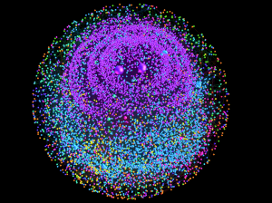
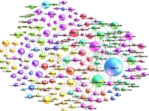
This means its now time for an intermezzo with some pretty pictures, courtesy of Gephi. The node color is determined by the worksheet the node comes from and the size of a node is determined by how many cells it depends on. Ever think an aircraft design problem could look pretty? 🙂

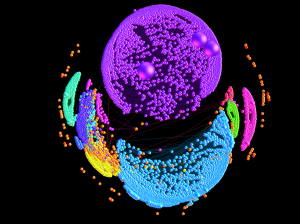
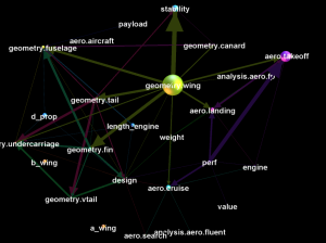
Using some layout algorithms you can start pulling things apart:


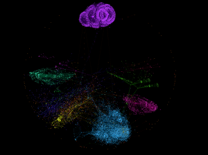
And look at the macroscopic structure:

Or zoom in for the microscopic structure:

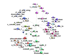
Here the colors represent which variable group the node belongs to. Stripping out things further you can look at one particular variable, for example the wing area, and see how it influences others:

Finally, optimization
Ok, so I could now serialize an excel spreadsheet to a python graph. However, the ultimate goal is to build an aircraft that can actually fly, or in aero speak, it is balanced (lift equals the weight, center of gravity is in the right place, etc.) This still involves an optimization process which now had to be done in Python. For this I added an extra layer on top of the compilation process using OpenOpt. After some bugfixing and testing I am happy to report that, without doing anything fancy, it solves in 98% of the time and takes 30 seconds to 1 minute to solve. Compared with the original 65% and 10 minutes.
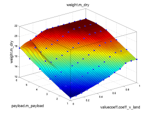
As a sanity check I then did some parameter sweeps to generate surface plots such as these:

Roughly this plot tells you that as you increase the payload weight and the importance of a low landing speed, your dry weight (the weight without fuel) goes up. Which is exactly as you would expect (ignore the ridge at the bottom left).
Where is the code?
My employer has been kind enough to let me release the code which is now available on github! An example is included and the readme lists the pro’s and con’s of the current functionality. May the patches roll in 🙂
Thoughts and Future work
So far this has been an interesting little side project and been very useful in the wider design system. Recall from my previous post that this is just one small piece in the puzzle. In the wider system this is linked up with CFD simulations, costing codes, an operational model and what have you. One disadvantage of spreadsheets, though, is that designers tend to use large tables to interpolate out equations instead of writing a few lines of code. This can add large numbers of nodes/edges to the graph, thus increasing the visual complexity, without adding much to the true problem complexity.
I think there is potential to explore this topic further, but this would really need an application specific layer on top of a graph-only tool like gephi. However, it does not look like this is where my priorities will lay, but maybe it will inspire somebody else 🙂
There is a good chance I will be revisiting this type of work when we look at visualizing design rationale data and how it evolves during the aircraft design process. But that is a separate topic for a separate post 🙂
Thoughts, comments, suggestions, constructive criticism, patches? Dont be shy!
–Dirk


